
There are three primary colours. Red, blue and yellow.
Amazingly all colours can be made from these three colours.
Mixing blue and yellow makes green.
Mixing blue and red makes purple.
Mixing red and yellow makes orange.
I find this magical how just by mixing two different colours can make a completely new colour.
Of course, there is also white and black which aren't colours but when mixed with colours can change the tone either lighter or darker.
Obviously adding white lightens the tone. You will find that you use three times more white than any other paint. It is what can bring those distant soft lights to your skies and water.
For the darks, I don't actually use black, but Paynes Grey as it has a deep blue in it which makes a great grey.
Normally lighter toned colours recede into the distance where darker tones come forward.
For example in landscape painting, which is what I will be mostly talking about, the lighter tones
would be just above the horizon in the sky gradually getting darker as you move to the top of the sky. This gives an effect as if the sky is coming over your head towards you and adds to the perspective.
Generally, the foreground has the darkest tones and contrast and is often where you would have the most detail. Just like looking at a natural landscape scene. The most details you can see are closest to you.
Having a focal point in the foreground with strong contrast (dark next to light) for example, a boat, tree or person gives the eye something to go straight to and then discover the rest of the painting after that. This keeps the viewer interested in your picture. Its very important to keep the viewer intrigued. You have been to art shows where you just walk past many pictures and then one will stand out and you just want to keep looking at it and sometimes you're not sure why.
This is because the artist has put many of these elements into the work and has thoughtfully constructed the composition (shapes), colours, tone, contrast and detail to excite the eye.
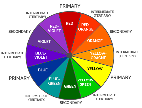
There are also complimentary colours which work well when used next to each other.
These are basically the colours that are opposite each other on a colour wheel (see diagram below).
When you put green next to its complimentary red, or blue next to orange, or yellow next to violet it can really lift your painting. They can also be used to tone down vibrance in a colour without it getting muddy. Too yellow, put some violet in it. Too blue, put some orange in it etc…